
FITTED.
GETTING INTO
SHAPE HAS NEVER
BEEN EASIER.
User Interface (UI)
Branding
MY ROLE
UI Designer
CLIENT
CareerFoundry
DATE
Oct 2021 - June 2022
TOOLS
Figma, Adobe Photoshop,
Illustrator & XD, Procreate, Marvel
PROJECT SPOTLIGHT
-
Majority of the work was on user interface (UI) design with a focus on the layout, visual hierarchy and interaction design
-
Final product includes all assets, wireframes, working prototype and a brand guideline complete with brand elements such as the logo, colour palette, typography, and imagery
01 UNDERSTANDING THE PROBLEM
Getting back into exercise can feel like an ordeal. How might we create an experience so that users can learn about new exercises, stay motivated to exercise, and see their progress over time?
FITTED is designed to motivate people to commit to an exercise routine that suits their level, schedule, and lifestyle. As the user research had already been done by the client, the focus on this project was on the user interface (UI) design.
02 CREATING THE FOUNDATION
USER FLOWS
AND WIREFRAMES
The research provided by the client already covered user stories so I started the project off by creating user flows as a stepping stone to create initial wireframes. I like to use user flows as a method to identify what screens users will typically see and how they interact with those screens. The below user flow outlines the steps of how a new user would discover different exercises that were relevant to them.

It is always good for the team to see design ideas in action, so I created initial wireframes based on the user flows next. Although these sketches were rough, they were helpful in helping me identify which UX patterns and features we should include. I uploaded the wireframes onto Marvel app and created the first iteration of a prototype.
THE FIRST
WIREFRAMES
AND PROTOTYPES


Initial wireframes created on Procreate
FROM LOW- TO
MID-FIDELITY
PROTOTYPES
After getting feedback on the low-fidelity prototype, I started building mid-fidelity wireframes. The team had already identified which problems we wanted to solve so I needed to flesh out the rest of the design with the right UI patterns while also considering what's above the fold.
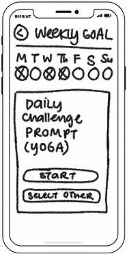
One finding that came out when reviewing with the team was that seeing just one workout option on the homepage wasn’t good enough. From this, I decided to:
1) merge "Weekly Goals" with "Your Progress"
2) add in more workout recommendations to increase the odds of a user committing to a routine
These changes were reflected in the next iteration of wireframes.
WHAT I LEARNED

This was the first time I’ve designed a user interface without doing the actual user experience research myself. This meant having to prioritise user flows and processes without additional user input and context, both of which usually greatly inform my design decisions. Learning to design with less information than I’m used to was challenging, but it also gave me more space and time to explore design options and user interactions.
03 STEPPING UP THE DESIGN
Using the brief, I started brainstorming colours, shapes, and images that would best encapsulate the essence of FITTED. But first, we had to answer the question: what IS the essence of FITTED? For the team, bright cheerful colours came to mind, and key words such as "easy, informative, fun" formed our driving inspiration.
I developed two different visual directions that could possibly work for FITTED. Click on the image to see why the team chose the one we did, and to see the other moodboard.
MOODBOARD

After the typography, colour palette, icons, and imagery had been set, FITTED’s branding started to come together, However, the signature style was not coming through in all the designs. After receiving feedback from the team that certain screens still had a ‘mock-up look’ to them, I addressed this problem by adding in accent colours and stylising the icons.
While the changes were minor, the team felt that:
1) the changes led to a more defined UI that looked less generic
2) it was now easier for them to identify the content hierarchy
CREATING A
SIGNATURE STYLE

Low-fidelity Wireframe
Mid-fidelity Wireframe
Final Design
?


As I was putting together the mid-fidelity wireframes, something about the home screen didn’t feel right. The screen felt cluttered and after consulting the team, we decided it wasn’t necessary to have two navigation systems (both the bottom navigation and hamburger menu). Since the homescreen included shortcuts to most of the major components of the app, we decided to simplify the navigation system by removing the bottom navigation and folding all the main links into the hamburger menu. This led to a slicker UI.
TWEAKING THE
NAVIGATION

Homepage with the Bottom Navigation

?
Final Design
At this stage, the product was coming together nicely but the experience lacked finesse in the interaction design. We decided to add gestures and interactions to help users perform tasks quickly as well as to give user feedback as use the app. This gave me the opportunity to teach myself how to create animations on Figma. The end result was a smoother app experience that felt more complete.
ADDING FINESSE

WHAT I LEARNED

Whenever I got stuck with designing one of the screens, I found it particularly useful to step away from the project and come later with a fresh set of eyes. I particularly struggled with how to layout the home screen but taking the time to look for inspiration as well as consulting my team gave me enough to push through and come up with a design everyone was happy with.
04 FINAL STEPS
User research showed that it is important to the FITTED user to be able to access Fitted content wherever, whenever. This meant building a responsive website that would work seamlessly on their phone, tablet, or computer. While the content remained the same, we made sure to adapt it to fit different breakpoints so that the content was optimized to best fit the device screen.
MAKING IT
RESPONSIVE

This last stage included finalizing design documents and preparing all the files to handover to the Developer team. In order to save the FITTED team time, money, and frustration, I created a brand visual style document to serve as a guide for the team or anyone else who may work on FITTED in the future.
FINALIZING AND
HANDING OVER

THE FINAL PROTOTYPE
At the end of the project, we delivered the design specs of the final iteration of the prototype to the developer team. This includes the brand style guide, all of the assets, and the design wireframes.
The next step for the team is to run usability tests with users. Using the feedback from the usability tests, we will continue to tweak the design until we reach an iteration that can be handed to the developer team to create the MVP of the FITTED app.
FINAL LEARNINGS

1) Due to the scope of the project, I focused mainly on the user interface design. However, if I had more time and resources, I would have liked to delve deeper into the UX research. I believe this would have helped me pinpoint a unique selling point for FITTED, helping it to better stand out in the market down the road. I would have also fleshed out the user personas/built mental models so I could better understand the motivations, frustrations, needs, and goals of the users I was designing for.
2) The success of an app like FITTED heavily depends on good assets and content. While I have designed the current prototype using stock images from UnSplash, the quality of the actual assets used in the final project will depend on client budget. This could make or break the app so I reminded the project team that they will need to budget enough resources (both financial and manpower) in order to capture high-quality original content.
3) With so much content and limited screen space, I learned to prioritize what was important enough to be placed above the fold. This is also the first project I've worked on where I've been able to include interaction design to enhance our users' experience with FITTED - an exciting step in my learning journey!


Liked what you saw? Still have questions?
Get in touch at designwithyangie@gmail.com