
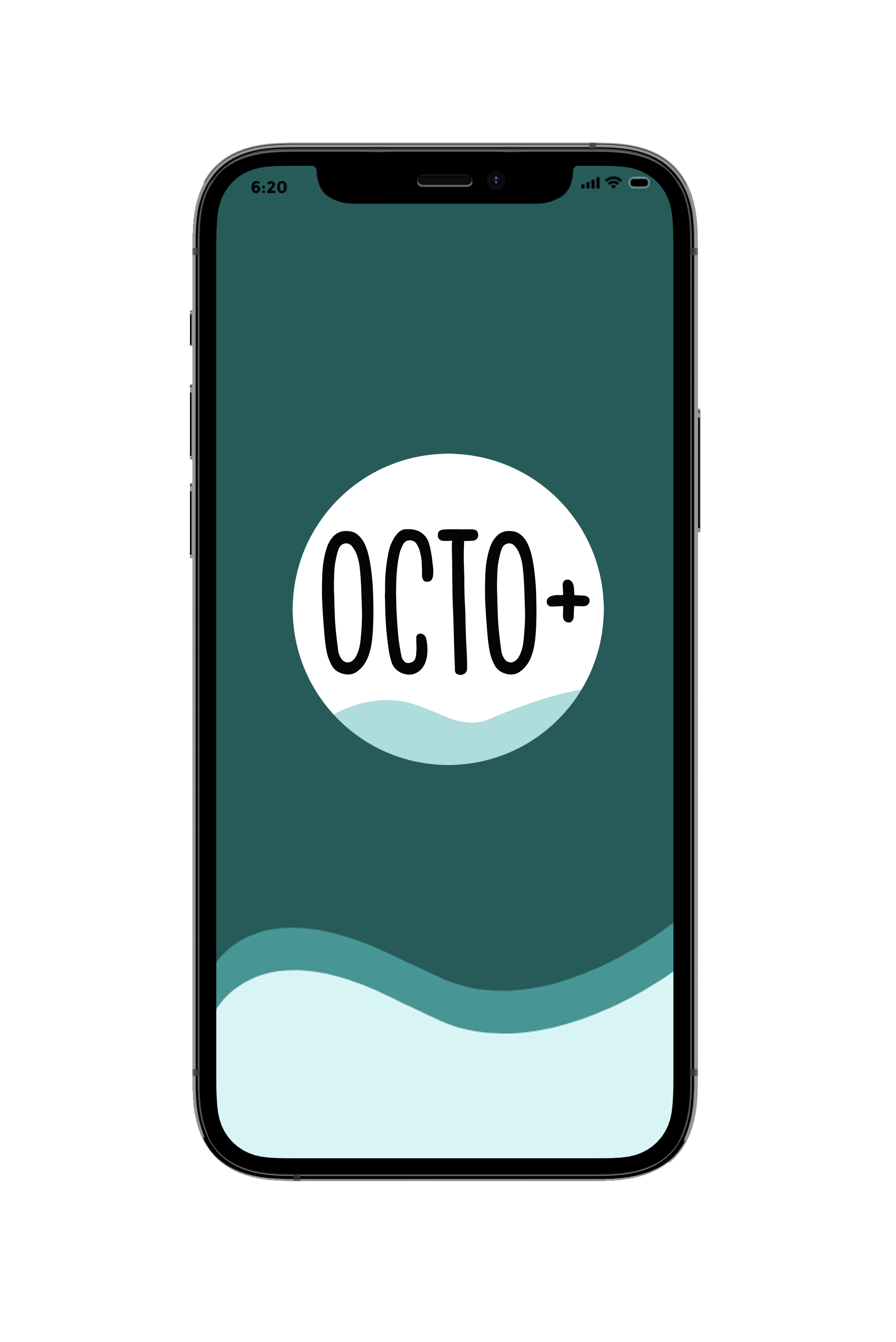
Octo+
Designed for Divers, By Divers
A Case Study
OctoPlus (Octo+) is designed to help divers discover new adventure opportunities around the world. We also provide beautifully displayed and easy to understand wind/wave/weather reports, forecasts, and statistics to water enthusiasts on-the-go.
THE DETAILS
MY ROLE
UX/UI Designer
CLIENT
Career Foundry
DATE
May 2021 - September 2021
TOOLS
Adobe XD, Photoshop, Illustrator, Figma, Optimal Sort, Usability Hub, Affinity Designer, Procreate

DID YOU KNOW...
...there are as many as 6 million divers worldwide?!
Within this 6 million divers, we are designing for the independent-minded divers who like to be in control of their experience and not just rely on their tour guide/dive master/diving centre for trip planning and weather information.
THE PROCESS
Discover, Define, Design, Deliver
I like to use User Centric Design strategies to ensure I am always putting users at the center of product design and development. The design process model I chose to follow in this instance was the Discover, Define, Design, and Deliver design thinking model.
Keep reading to learn more about this process!

DISCOVER

The Discover stage entailed researching the problem space, framing the problem to be solved, and gathering enough evidence and initial direction to move to the Define phase. I consulted diving experts and community members to gain empathy and better insight into their needs, and conducted analyses to better define the problems to be solved and of the opportunities through the below exercises:


01 COMPETITIVE ANALYSIS
I looked at both well-established weather apps and apps created for the diving community such as log-book apps, scuba spot travel guides, community forum apps, and wildlife spotting apps.
02 USER RESEARCH
User research was conducted through a survey posted on various dive forums, as well as
4 in-depth interviews that allowed me to probe further into what divers are looking for if they could build an ideal app to improve their dive experiences.
03 USER PERSONAS
I created user personas based on my research to 1) better give the data and findings a human face and narrative and 2) to ensure that I keep the user audiences at the forefront of my mind during every phase of the design process.
04 USER JOURNEYS
I then created user journeys maps to better define the users’ mental models, beliefs, and behaviors. By mapping out their emotional journeys, it was easier to highlight painpoints that need to be solved in later stages.


Main Takeaways:
-
The Discover part of the process needs to be solution-agnostic. As designers, we must go in with an open mind, otherwise it'll just end up being a validation exercise
-
Sorting findings into affinity maps and clusters helps with identifying patterns and findings quickly
-
Interacting with users in their natural environment is the most effective way to extract details you wouldn't otherwise have access to
My learnings and findings from this phase helped solidify the below design goal.

THE DESIGN GOAL
"How might we help divers easily understand weather and water conditions
on-the-go and better plan for their next dive adventure?"
Users need a way to check weather and water conditions on the-go before heading into the water because current weather and water-sports apps can be overwhelming with too much information and often are not catered towards the scuba community. With this in mind, I continued on to the next stage: Define.

DEFINE

In this next phase, I channeled my energy into defining the goals, objectives, and strategy for the UX of the app. I used the information gathered in the Discover phase to form my users’ objectives and mapped out user flows for the personas’ primary tasks. From here, I was able to create a sitemap that fulfilled the main features that had been pinpointed as the priority. Based on the sitemap, I was also able to move forward with initial sketches for Octo+.


This stage split into 3 parts:
1) Information gathering
2) Creating Task Analyses
3) Creating User Flows
This stage was split into 3 parts:
1) Building the initial sitemap
2) Validating the sitemap with potential users
3) Refining the sitemap
Time to pick up the pencil and start designing! Rough initial sketches helped get the design juices flowing and these designed form the basis of the app.

01 TASK ANALYSIS AND USER FLOWS

User Journey Maps
Task Analysis
User Flow
The task analysis and user flows were an effective way for me to deduce what the users are trying to achieve, how they go about achieving it, and how effective they are. . This exercise helped put me in the user's mindset so I could properly understand their considerations at each step of the way.
02 BUILDING AND REVISING THE SITEMAP
A sitemap is the skeleton to the app, so it's important to get this stage right. This involved identifying the primary pages of the app and putting together the first version of the OctoPlus sitemap. To reduce information bias, I conducted an open card sort with potential users to validate and/or challenge the sitemap.
The results of the open sort showed that the participants agreed mostly with our original sitemap but I did make some changes (shown below) based on the feedback I received.

Conducting an Open Sort on Optimal Workshop

The revised sitemap with changes marked
03 THE INITIAL SKETCHES
Once the sitemap had been finalized, I identified 3 key features and got started on sketches for the app itself, beginning with the navigation patterns. The sketches were created on the iPad using Procreate and the Apple Pencil. These are all responsive web app designs.

DESIGN

This is the phase where I focused my energy in finding the right solution for Octo+ users. I want Octo+ users to feel empowered to make their own decisions regarding trip planning and dive safety after they consult the app. To get there, I split the design phase into multiple steps: prototyping, testing, refining, and finalizing the design. As this was an iterative process, I was able to continually learn how to better improve my app at each stage.


Prototyping was split into 3 stages:
1) Low-fidelity prototpyes
2) Mid-fidelity prototypes
3) First interactive prototypes
Testing was split into two stages:
1) Usability test using the interactive prototype
2) A/B testing
This was split into multiple stages:
1) Analyzing the test
2) Prioritizing changes
3) Evaluating the design
4) Getting further feedback
Only one thing left to do - implement all the changes into the most updated high-fidelity prototype!


01 PROTOTYPING: LOW-FIDELITY
Creating low-fidelity prototypes allowed me to create and visualize design ideas and flows quickly. Having these sketches available in front of me allowed me to study and refine details before sharing them with fellow designers for input on how to improve the design.
Example 1: Looking up the weather forecast on the mobile web app.


Example 2: Planning a new trip by entering specific criteria
01 PROTOTYPING: MID-FIDELITY
Once I got to a stage where I was happy with the basic design, I moved onto Figma to create the mid-fidelity wireframes. At this stage, I paid more attention to functionality, keeping in mind how each element worked in relation to the others.
Next up - the first version of an interactive prototype!

01 PROTOTYPING: FIRST INTERACTIVE VERSION

Scan or click to check it out
I continued to fully flesh out the below key features for the mobile web app:
1) Onboarding and sign-up
2) Building a user profile
3) Looking up a weather forecast
4) Planning a dive trip
The interactive prototype was created on Adobe XD.
Learning Alert
Whilst using 3 different programs during the prototyping phase meant spending more time creating the wireframes, it also gave me the chance to practice and hone my skills across the 3 different programs. This also allowed me to understand the pros and cons of using each program.
02 USABILITY TESTING: THE OBJECTIVES
Before moving onto the high-fidelity prototype, I wanted to put the design to the test just in case there were major usability issues that I couldn't see. The usability test was designed to:
1.

Observe and measure how quickly participants are able to sign-up, as well as if there’s a risk of drop-off during the
sign-up process
2.

Find out if participants can easily locate the main functions: search, plan a trip, and setting up their profiles.
3.

Observe whether participants find the app useful so far and whether they are inclined to
download the app in the future
6 usability tests were conducted with participants who were recruited via personal networks to take part in the study. The baseline requirement was that they have their diving license and have expressed interest in taking a diving trip in the next 1-3 years. The participants varied in their experience ranging from beginner divers to dive masters, giving us insight on how divers across the spectrum would use the app.
02 USABILITY TESTING: THE RESULTS
Notes from each of the 6 interviews were colour coded and made into affinity maps using 4 categories: observations, positive quotes, negative quotes, and errors. From there I sorted the information into categories that would better allow me to identify patterns in the feedback that can be translated into actionable tasks. The categories that stood out were: general feedback, user preferences, weather, visuals, navigation and structure, page content, and errors.

The clusters were then translated onto a rainbow spreadsheet which made it easier to prioritize which tasks and errors to focus on in the next round of design.

02 A/B TESTING: DESIGN DIRECTION
A preference test was also conducted to see whether the users preferred a graphic-based visual style or a photo-based visual style. The goal was to lock down a visual style before starting the next round of designs ahead of the high-fidelity prototype.
Participants were invited to take part in the test hosted on Usability Hub and asked to choose which designs they preferred.
An overwhelming majority of the participants preferred the photography-based visual design so I decided to go ahead with that style in my next round of designs.


Option A:
Graphic based
sign-up screen
Option B:
Photography based
sign-up screen


Option A:
Graphic-based
onboarding sequence
Option B:
Photo-based
onboarding
sequence
03 REFINING THE DESIGN

The app logo before and after the redesign
Step 1:
On top of the prioritized tasks identified during usability testing, I also reviewed the visual design in accordance to Gestalt's Properties and the Principles of Design, as recommended by Career Foundry. This is also point at which Vela was rebranded to OctoPlus (Octo+), a name which has stronger marine connotations than Vela.
I implemented these changes and created a
high-fidelity interactive prototype.
Step 2:
Design feedback is an important step in the design process as it allows me to 1) identify problem areas in my work quickly, 2) validate effective designs, and 3) most importantly, it enables me to grow professionally and learn from fellow designers.
I gave the app to 3 Career Foundry (CF) design peers for feedback. I received mainly positive comments regarding visuals and design, but also critical comments about navigation and UI components. After careful evaluation, I chose the most relevant feedback and incorporated these changes into the app.

Working with the CF student community for feedback

DELIVER

At this stage, the design was mostly complete so it was time to prepare the deliverables for handover to the Developer team. On top of organizing a summary of my research, wireframes, mockups, and assets, I created a style guide and pattern library so corresponding teams know how to keep design consistent across the app. This was also a good time to plan out next steps before wrapping up this project.


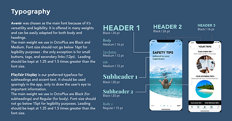
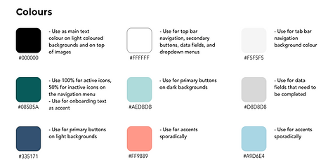
01 DESIGN LIBRARY
On top of the high-fidelity prototype, I implemented the OctoPlus (Octo+) Design Language System to help OctoPlus teams achieve efficiency, consistency, and scale through rules and standards that help streamline design. OctoPlus users deserve a clean and congruous user interface no matter what platform they’re on, and the below guideline will help future teams achieve this.

02 NEXT STEPS
Thanks to feedback from potential users as well as fellow designers, the design of OctoPlus is off to a great start. However, as with design, there is always room for improvement.
Next steps include:
-
Finish fleshing out the other features that have been earmarked as part of Phase I
-
Further enhance the customized safety and weather alerts feature
-
Continue developing the community aspect of the app (reviews of services, locations, and overall experience)

Liked what you saw? Still have questions?
Get in touch at designwithyangie@gmail.com